The Changing Nature of Color
Not Quite a Chameleon
Color isn’t exactly a chameleon in its ability to change in appearance, but you might think so at times. I’ve seen a wall in a client’s home that looked surprisingly different in color from one end of the wall to the other.
An important thing to understand about color is that color is “unstable”. Meaning, the color appearance of any object, or the appearance of any color on any surface, does change.
There are three main things that cause color to change in appearance:
- Light
- Texture
- Interaction with Other Colors
“Why”, you might ask, “does it help me in dealing with colors in my interior to know about these effects?” Good question. My answer: One of the main times it’ll help to know is when you’re selecting interior wall paint for your home.
Taking The Causes One at a Time
- The Effect of Light
Anyone who has walls or an accent wall painted in a color may have noticed how different the color can look at different times of the day, in different weather conditions, or in different artificial lighting. This is color being affected by light. Not just how much light, but the quality of the light or the type of light.
So, when you’re trying to pick a wall paint color this is what you need to do:
- Bring some paint chips home in the range of colors you’re thinking of using. Never pick your color looking at the chip in the store — the lighting in your house is going to be very different than the lighting in the store. It’ll make a big difference in how the color looks.
- Once you think you’ve found the right color, you need to buy a quart of your color (or one of those sample sizes if available) and paint a sample larger than that little chip. The recommended size of your sample: 3′ x 3′. (Even a smaller sample size can work just fine, typically, but at least 12″ square. Go for a larger size if you can.)
- You have two choices for painting your sample:
A) You can paint it on a piece of poster board or foam core and look at it in different lighting. Also, preferably, set it in different spots to look at it on different walls since each wall is getting light differently. or
B) Paint a patch directly on your wall, or walls. (Sure, your walls are going to look funny for a while — at least until you’ve picked your color and painted the whole wall.)
- The Effect of Texture
Since texture affects the appearance of color, method #2B above may be the best way to go. The same color will look different on a smooth surface as opposed to a textured surface, mostly in terms of how light or dark it appears. It’s very likely that your walls have texture, so you want to see what that color looks like on your wall — not on the foam core which has no texture. Why the difference? Well for one, those nooks and crannies of texture create shadows on the surface causing the color to appear darker. It also has to do with the way light reflects off the textured surface.
Also to consider regarding texture is the sheen of paint. Each sheen, flat, semi-gloss, etc., has a different texture when applied. Buy the sample quart of paint of your color in the sheen you plan to use. You don’t want any surprises. (BTW, those little sample jars usually come in just one sheen.)
- The Effect of Colors on Other Colors
Colors affect other colors. It’s a visual phenomenon. It can be a matter of colors being juxtaposed, or even colors that are in close proximity. The effect can be particularly pronounced when a color area resides within a background color area.
So, in picking your paint color and painting your sample color, follow these guidelines:
- If you paint your sample color directly on the wall, unless the existing color is white, be sure to paint, first, a larger patch of white to contain your new color sample.
- If you use the foam core method, leave a white boarder.
Below are examples of background colors affecting foreground colors. (Much of the concepts regarding the interaction of colors are based on the teachings of Joseph Albers, a teacher at the famous Bauhaus school of design in the 1930s. Reference: Joseph Albers, “Interaction of Color”.)
The square in the center of each rectangle, is the exact same color. You can see how the background has affected the color. If you didn’t know they were the same color, you would never have guessed. As Joseph Albers states: “…no normal human eye is able to see both squares — alike”. Below the group is the square against white. Definitely we can see how background color affects the way a color appears.
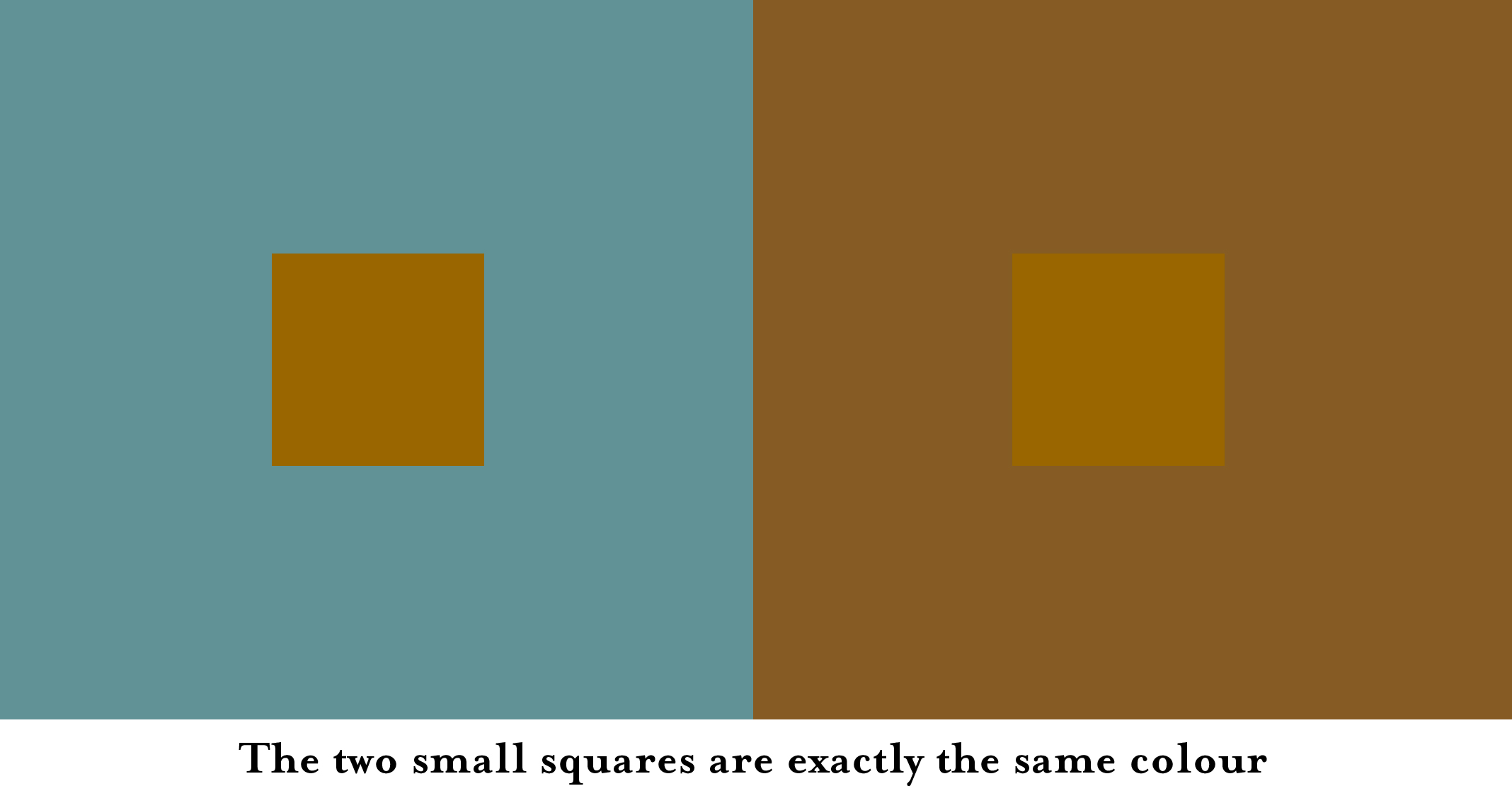
So, to test your paint color sample, use white around the sample. Otherwise, your color test will not provide an accurate story of how the sample color will really look.
Some Mysteries of Color Revealed
It’s fascinating and informative to understand the “mystery” of color change. Being armed with this bit of information will surely help when you’re trying to select a new color for your interior walls.
Changing wall color, or adding an accent wall color, can be exciting. We all need change from time-to-time. Here’s to successful color updating in your home.
Facebook Conversations